Skinning HowTo/Basics
| Help Portal: |
Avatar | Bug Fixes | Communication | Community | Glossary | Land & Sim | Multimedia | Navigation | Object | Video Tutorials | Viewer | Wiki | Misc |
This page is a stub. Improvements to this page are freely welcomed!
New skins have already been created -- see the page Skinning - Post Your Skins Here.
For a full list of tutorials -- see the Skinning_HowTo/Basics#See_Also section.
If you would like to add tutorials with more than Basic information, you might choose to name your page along similar lines:
- Skinning HowTo/Resize the toolbar
- Skinning HowTo/Changing a highlighting effect
- etc
Intro
This page describes the skinning capabilities of Viewer 1.20 and higher, and until it becomes the official viewer, assumes you have the 1.20 Release Candidate installed.
The skinning capabilities of the Second Life viewer are currently limited, but will be continuously improved through the development of the Skinning Project. This document sets out some basic information about the structure and loading of UI textures, colors, floaters as defined in XML.
Caution is always warranted when making changes to Second Life's installed files. In some cases the viewer will crash if an XML file is missing requisite node or element, or if such an element is malformed/misspelled. Making a backup copy of the unaltered files is highly recommended. If a malformed file prevents you from running the viewer without an immediate crash, you will need to restore the original file; or re-install Second Life from the download page.
Helpful Tools
- You will need an XML editor program for more easily making edits to an XML file.
- One such editor that is free and open source is Komodo Edit.
- Most Windows versions do not provide a thumbnail view for tga files (an essential feature while editing the skin files). Thumb Plug TGA is a free open source tga thumbnail plugin that will provide this functionality.
- OpenSim is a free and open source version of the SL Simulator that you can run yourself. Next to your xml editor and imaging program, this will be your most important tool while skinning the viewer. Linden grid logins can be slow, or disabled, and are inconvenient for testing things like a one line edit of an XML file. Logins on a simulator running on your local machine are significantly faster than logins sent over the Internet, thus providing a quick and easy testbed for edits you've made to your viewer skin.
- Official OpenSim website
- Read the "User Docs" page for instructions on how to download and setup your personal simulator.
- How to connect to an Open Simulator with your viewer
Its usefulness cannot be stressed enough when dealing with xml files that need a relog (such as colors.xml).
- Advanced > UI > Show Name Tooltops
Shows the xml file name or UI path of whatever element your mouse is hovering over.
- Advanced > XUI > Edit UI...
A barest of bones xml file editor. Useful for testing spacing and layout for portions of the UI without relogging.
\SecondLife\skins\[SKIN]\ folder
(Note: colors.xml and colors_base.xml are now associated with specific viewer skins. Each skin folder has its own copy of colors.xml and colors_base.xml)
colors_base.xml
This file defines the basic colors of the UI as separately named nodes.
- WARNING: It is highly advisable that you do NOT MAKE CHANGES to this file. Instead, copy & paste entries from this file to the next file (colors.xml) -- which overrides settings in colors_base.xml. The viewer will crash if any requisite entry is missing or malformed in colors_base.xml!
colors.xml
By default, this file has no entries. However this file can contains entries which will override any identically-named entry in colors_base.xml.
The format for specifying a color is
value="[R],[G],[B],[OPACITY]"
...where R,G,B,Opacity are in the range 0-255. For opacity, 128 is half opacity (ergo, half transparent).
(Note: Opacity is also sometimes called the Alpha value)
- For example, you could copy the following entries from colors_base.xml and paste them into colors.xml, where you can make adjustments:
<!-- CHAT AND IM HISTORY TEXTBOX COLORS -->
<ChatHistoryBgColor value="0, 30, 80, 200" />
<ChatHistoryTextColor value="255, 255, 255, 255" />
<IMHistoryBgColor value="0, 30, 80, 128" />
<IMHistoryTextColor value="255, 255, 255, 255" />
- For ease of use, there is also a fully commented colors.xml file on the wiki that labels each setting.
\SecondLife\skins\[SKIN]\textures\ folder
2008-04-08: This is where the viewer's installed textures reside.
*.j2c, *.tga, *.jpg, *.png
- Many of these textures have a filename by UUID
- most of these are installed textures used on Orientation Island.
- As part of the Dazzle project, every texture that is used in the UI now has a human-readable english filename... with the following EXCEPTIONS (these omissions will be converted in the Skinning Phase 1):
- 7a0b1bdb-b5d9-4df5-bac2-ba230da93b5b.tga (Create tool iconic button)
- 0098b015-3daf-4cfe-a72f-915369ea97c2.tga (Create tool iconic button, selected iconic button)
- 3c18c87e-5f50-14e2-e744-f44734aa365f.tga (Scroll-left-to-firstone |< icon)
- 7dabc040-ec13-2309-ddf7-4f161f6de2f4.tga (Scroll-right-to-lastone >|, highlighted icon)
- 9cad3e6d-2d6d-107d-f8ab-5ba272b5bfe1.tga (Scroll-left-to-firstone |<, highlighted icon)
- 89e9fc7c-0b16-457d-be4f-136270759c4d.tga (Volume "speaker" icon)
- 5748decc-f629-461c-9a36-a35a221fe21f.tga (blank icon)
- In a future phase of Skinning it is planned to move these UI textures to a separate folder so they can be found/manipulated together more easily.
- In the past,icon graphics/textures had to have an image size that was a power of two (eg, 32x128, 64x128, etc), but now they can be any size (eg. a 24x96 image).
textures.xml
2008-04-08: Here is an example of some simple entries in textures.xml. They have no stretch rectangle defined, not preloaded, are not referenced by UUID:
  <icon_auction.tga/>
  <icon_avatar_offline.tga/>
  <icon_avatar_online.tga/>
  <icon_day_cycle.tga/>
  <icon_diurnal.tga/>
  <icon_event.tga/>
  <icon_event_mature.tga/>
  <icon_for_sale.tga/>
  <icon_group.tga/>
  <icon_groupnotice.tga/>
  <icon_groupnoticeinventory.tga/>
  <icon_lock.tga/>
  <icon_place.tga/>
  <icon_popular.tga/>
  <icon_top_pick.tga/>
scaling rectangles (scale_rect)
UI art textures are often stretched (scaled) in various resizing to accommodate different widths or heights of the same widget. In order to preserve a crisp look of edges, part of the image is 'preserved' or protected to not be scaled. By default, the stretching will preserve 8 pixels on all sides of the image.
- To change this default, you set a <scale_rect /> element.
<scale_rect left="x1" top="y1" right="x2" bottom="y2" />
- The pixel coordinates of the image here are counted from a (0,0) position that refers to the LEFT BOTTOM corner. (Like a Cartesian coordinate system in quadrant I.)
- For example, this image toolbar_btn_selected.tga has dimensions of 128 pixels width x 24 pixels height:
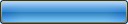
- The following <scale_rect /> code...
 <toolbar_btn_selected.tga>
       <scale_rect left="26" top="24" right="102" bottom="0" />
 </toolbar_btn_selected.tga>
- ...defines a stretchable rectangle that preserves 26 pixels to its left & right:

use_mips
(under construction)
preload
Setting preload="true" means the texture is loaded at runtime, before the login screen appears. In general it is best to preload as few textures as possible, since this affects memory usage of the viewer.
Example:
<checkbox_disabled_false.tga preload="true" />
\SecondLife\skins\[SKIN]\xui\ folder
- XUI (pronounced zoo-e) stands for XML User Interface. XUI consists of a custom XML data format for describing Second Life's user interface, and the code which processes that data and integrates it with the Second Life viewer.
..\[lang] folders
When another language is selected in the viewer (Preferences > General > Language), then the files in the appropriate [lang] folder are loaded hierarchically on top of the en-us version, starting the next time the viewer is run.
If an element (or entire file) is missing in the [lang] version, then the viewer falls back to the value specified in the en-us version.
2008-04-08: Existing languages included in the viewer include:
- \ko Korean
- \ja Japanese
- \de German
- \fr French - not officially supported nor updated regularly
- \es Spanish - not officially supported nor updated regularly
- \zh Simplified Chinese - not officially supported nor updated regularly
The \[lang] version of floater or panel contains only the minimum values desired to override from the en-us version.
- Generally this includes only a) the matching
name=property and b) the translated string/label=. - However in some cases a separate per-language width may be specified, in order to adjust the size of a particular widget for that language only.
..\en-us folder
This folder is where the size of floaters, panels, and widgets are defined, as well the text strings in English used by the viewer.
IMPORTANT NOTE: Do not ever change any name= parameters from the existing (English) name. The name= parameter is used to identify each node as expected when called in the viewer code, and to match it to other translations of the same node.
Related to localizations
A further discussion of the English text strings and how these are manipulated to make translations can be found at How to Localize Your World
Related to colors
2008-04-08: For purposes of skinning, it is important to note that there are still 2 XML files at this time which specify a color from within the \en-us folder. In the Release Candidate:
1. \skins\default\xui\en-us\floater_instant_message_ad_hoc.xml
- contains a <text_editor /> widget with a
bg_readonly_color, bg_writeable_color, text_color,andtext_readonly_color:
- A. Widget named "im_history"
<text_editor type="string" length="1" bg_readonly_color="ChatHistoryBgColor"
	bg_writeable_color="ChatHistoryBgColor"
	bottom="-265" embedded_items="false" enabled="false"
	follows="left|top|right|bottom" font="SansSerif" height="239" left="5"
	max_length="2147483647" mouse_opaque="true" name="im_history"
	text_color="ChatHistoryTextColor"
	text_readonly_color="ChatHistoryTextColor" width="490" word_wrap="true" />
- These 4 values could be set as either a named entry in colors.xml (
bg_readonly_color="ChatHistoryBgColor") or directly as an R,G,B,O value (bg_readonly_color="50, 115, 185, 150")- Note: you can set a text color to any such <text_editor /> widget in the XML using the
text_color=parameter.
- Note: you can set a text color to any such <text_editor /> widget in the XML using the
2. \skins\default\xui\en-us\floater_chat_history.xml
- contains a couple <text_editor /> widget with a
bg_readonly_color, bg_writeable_color, text_color,andtext_readonly_color:
- A. Widget named "Chat History Editor"
<text_editor type="string" length="1" bottom="28" embedded_items="false" enabled="false"
	follows="left|top|right|bottom" font="SansSerif" height="74" left="5"
	max_length="2147483647" mouse_opaque="true" name="Chat History Editor"
	text_color="ChatHistoryTextColor" text_readonly_color="ChatHistoryTextColor" width="299"
	bg_readonly_color="ChatHistoryBgColor"
	bg_writeable_color="ChatHistoryBgColor"
	word_wrap="true" />
- B. Widget named "Chat History Editor with mute"
<text_editor type="string" length="1" bottom="28" embedded_items="false" enabled="false"
	follows="left|top|right|bottom" font="SansSerif" height="74" left="5"
	max_length="2147483647" mouse_opaque="true"
	name="Chat History Editor with mute" text_color="ChatHistoryTextColor"
	text_readonly_color="ChatHistoryTextColor" width="300" word_wrap="true"
	bg_readonly_color="ChatHistoryBgColor"
	bg_writeable_color="ChatHistoryBgColor"/>
Related to sizing
The XML files in this folder are also where you set the size (width=, height=) of UI widgets per floater, panel, etc.
The most comment parameters are listed here (under construction):
Common parameters
name
Required. The XML name of this element. The name must be unique to the floater you are editing.
- IMPORTANT: As noted above, do not re-name XML elements, even for localization. Many of the element names are looked up by the viewer. If the viewer cannot find an element name it expects, it will crash.
String: name="input_first_name"
width
Required. The width of the element, in pixels.
For text, this defines the visible text as well as the clickable area. If the width of a text element is not sufficient to hold the text, the text will be truncated. This is most likely what you will widen when localizing the viewer.
For most other elements, this describes the dimensions of an element, such as a button, icon, panel, text_area, etc.
- Tip: See the bounding boxes of all XML elements in the viewer: Advanced menu > UI > Debug Views.
Integer: width="140"
height
Required. The height of the element, in pixels.
For text, this defines the visible text as well as the clickable area. If the height of a text element is not sufficient to hold the text, the text will be truncated. This is most likely what you will lengthen when localizing the viewer.
For most other elements, this describes the dimensions of an element, such as a button, icon, panel, text_area, etc.
Integer: height="24"
left
Optional. Sets the position in the x dimension of the element's left edge relative to the container's left edge. Positive and negative values are accepted. A negative value will set the position relative to the right edge of the container.
Integer: left="6"
right
Optional. Sets the position in the x dimension of the element's right edge relative to the container's left edge. Positive and negative values are accepted. A negative value will set the position relative to the right edge of the container. Best used to align something to the right.
- For example, given a floater with a width of 500 and a button we wish to right align in the floater, we can set the
rightto 490 -- this puts the right edge of the button 10 pixels away from the right border of the floater.
Integer: right="6"
left_delta
Optional. (use instead of left) Sets the position in the x dimension of the element's left edge relative to the previous element, or, for the first widget, the left edge of the container. Positive and negative values are accepted. Best used to left-align the current element with the previous element.
- For example, given Button B with a width of 100, a previous Button A with a width of 50 and a distance between elements of 6, we would set the
left_deltato -106, putting the left edge of Button B 106 pixels to the left of Button A. We use a negative number to move left, and a positive number to move right.
Integer: left_delta="-106"
right_delta
Optional. (use instead of right) Sets the position in the x dimension of the element's right edge relative to the previous element, or, for the first widget, the left edge of the container. Positive and negative values are accepted. Best used to right-align the current element with the previous element.
- For example, given Button B with a width of 100, a previous Button A with a width of 50 and a distance between elements of 6, we would set the
right_deltato 106, putting the left edge of Button B 106 pixels to the left of Button A.
Integer: left_delta="106"
bottom
Optional. Sets the position in the y dimension of the element's bottom edge relative to the container. Positive and negative values are accepted. For example, given a floater with a height of 300 and a title 20 pixels tall and we want , we can set the bottom to (NEED TO DO MATH, LOL) -- putting the bottom edge of the title 40 pixels away from the top border of the floater.
Integer: bottom="(NEED TO DO MATH, LOL)"
bottom_delta
follows
Optional. Sets which edge(s) an element follows when the containing element is resized. Specifying all edges results in an element that can dynamically resize itself with its container.
Values: left, top, right, bottom. String multiple values together using pipes.
The following example sets an element to follow both the left and the top, such as a floater's title may be designed:
String: follows="left|top"
font
Optional. Sets which size and style of the application font to use. The default is SansSerifSmall for text elements and SansSerif for controls (such as check_box and button.
Values: SansSerifSmall, SansSerif, SansSerifBig, SansSerifBold, Monospace
String: font="SansSerifSmall"
icon parameters
image_name
Required. Specifies the name of the image to load for this icon.
String: image_name="myicon.png"
button parameters
scale_image
Optional. Specifies whether to scale the button art as its container/floater is resized. As of 1.18.x, all button art has this property set to true where the button size is not equal to 32x128.
Boolean: scale_image="true"
label
Optional. Label is the text on the button's face. Without a specified label (and no image_overlay declared), your button will be labeled "Button".
String: label="Click Me!"
label_selected
Optional. Label is the text on the button's face when pressed into an 'on' state. Your button will inherit the label if you omit this property.
String: label_selected="I've been clicked."
font
(under construction)
font_style
Optional. Styles the text. Allows multiple style selections. As of 1.18.x, the style options are:
- normal: Apply the default styles of the selected font. (For example, SansSerifBold has a default bold style applied to it.)
- bold: Bolds the text.
- italic: Italicizes the text.
- underline: Underlines the text.
- drop_shadow: Old-style 1px offset of black under the text.
- drop_shadow_soft: New-style 3px offset of blurred shadow under the text.
String: font_style="bold|underline|drop_shadow_soft"
halign
Optional. Controls horizontal alignment of label on button face. Options are "left", "center" and "right".
image_unselected
Optional. Overrides the default button art for the unselected/up and enabled button state. Art must be located in the ..\skins\textures directory within the Second Life application folder (on a Mac, this is inside the package at Contents/MacOS/Resources/skins/textures). Art must also be named in textures.xml with an assigned UUID. By default, the button art is stretched to fit the specified button size.
String: image_unselected="btn_square_32x128.tga"
image_selected
Optional. Overrides the default button art for the selected/down button state. Art must be located in the ..\skins\[SKIN]\textures directory within the Second Life application folder (on a Mac, this is inside the package at Contents/MacOS/Resources/skins/textures). By default, the button art is stretched to fit the specified button size.
String: image_selected="btn_square-down_32x128.tga"
image_hover_selected
Optional. Overrides the default button art for the selected/down and mouseover/hover button state. Art must be located in the ..\skins\textures directory within the Second Life application folder (on a Mac, this is inside the package at Contents/MacOS/Resources/skins/[SKIN]/textures). Art must also be named in textures.xml with an assigned UUID. By default, the button art is stretched to fit the specified button size.
String: image_unselected="btn_square-down-hover_32x128.tga"
image_hover_unselected
Optional. Overrides the default button art for the unselected/up and mouseover/hover button state. Art must be located in the ..\skins\[SKIN]\textures directory within the Second Life application folder (on a Mac, this is inside the package at Contents/MacOS/Resources/skins/[SKIN]/textures). Art must also be named in textures.xml with an assigned UUID. By default, the button art is stretched to fit the specified button size.
String: image_unselected="btn_square-up-hover_32x128.tga"
image_disabled
Optional. Overrides the default button art for the disabled button state. Art must be located in the ..\skins\textures directory within the Second Life application folder (on a Mac, this is inside the package at Contents/MacOS/Resources/skins/[SKIN]/textures). Art must also be named in textures.xml with an assigned UUID. By default, the button art is stretched to fit the specified button size.
String: image_unselected="btn_square-disabled_32x128.tga"
image_disabled_selected
Optional. Overrides the default button art for the disabled and selected/down button state. Art must be located in the ..\skins\[SKIN]\textures directory within the Second Life application folder (on a Mac, this is inside the package at Contents/MacOS/Resources/skins/textures). Art must also be named in textures.xml with an assigned UUID. By default, the button art is stretched to fit the specified button size.
String: image_unselected="btn_square-down-disabled_32x128.tga"
image_overlay
Optional. Applies an overlay image to the button. The button art will be sized to fit. As of 1.18.x, these icons should be 16 pixels high at maximum on a standard height 24px button to minimize scaling artifacts. Can be used with or without text. Art must be located in the ..\skins\[SKIN]\textures directory within the Second Life application folder (on a Mac, this is inside the package at Contents/MacOS/Resources/skins/[SKIN]/textures). Art must also be named in textures.xml with an assigned UUID. See image_overlay_alignment for alignment options.
String: image_overlay="icn_media-play_16.tga"
image_overlay_alignment
Optional. Sets the alignment of the image_overlay icon.
Values:
- left: left-aligns the art on the button. This standard is used for new button art with text in the Dazzle branch.
- right: right-aligns the the art on the button.
- center: centers the art on the button. This standard is used for new button art without text in the Dazzle branch.
String: image_overlay_alignment="left"
toggle
Optional. Determines whether the button is a toggle button or not. The Fly/Stop Flying button is a toggle button, for example.
Boolean: toggle="false"
text_editor parameters
<text_editor> creates a multi-line text box
max_length
embedded_items
font
word_wrap
hide_scrollbar
cursor_color
text_color
text_readonly_color
bg_readonly_color
bg_writeable_color
bg_focus_color
line_editor parameters
<line_editor> creates a single line text box
label
max_length
font
bevel_style
- none
- in
- out
- bright
- line
- texture
border_style
border_thickness
select_on_focus
select_all_focus_received
handle_edit_keys_directly
cursor_color
text_color
text_readonly_color
bg_readonly_color
bg_writeable_color
bg_focus_color
bottom
left
right
enabled
follows
handle_edit_keys_directly
height
width
mouse_opaque
name
bottom_delta
tool_tip
left_delta
tab_group
commit_on_focus_lost
is_unicode
increment
initial_val
max_val
min_val
visible
bg_visible
border_drop_shadow_visible
border_visible
drop_shadow_visible
h_pad
halign
prevalidate
v_pad
word_wrap
control_name
string parameters
name
word_wrap
tab_container parameters
enabled
follows
height
left
right
top
bottom
bottom_delta
mouse_opaque
name
tab_position
width
tab_width
tab_min_width
tab_max_width
border
tab_group
hide_tabs
panel parameters
border
bottom
bottom_delta
top
left
left_delta
right
enabled
follows
height
width
label
mouse_opaque
name
background_opaque
background_visible
bevel_style
bg_alpha_color
bg_opaque_color
can_resize
filename
tab_group
default_tab_group
placeholder
border_drop_shadow_visible
border_visible
border_style
border_thickness
border_color
tool_tip
title
auto_resize
user_resize
use_bounding_rect
bg_visible
can_close
can_minimize
left_in_finder
select
visible
text parameters
type
length
width
height
bg_visible
border_drop_shadow_visible
drop_shadow_visible
border_visible
bottom
bottom_delta
top
left
left_delta
right
enabled
follows
font
h_pad
halign
v_pad
valign
mouse_opaque
name
visible
tool_tip
tab_stop
initial_value
label
radio_style
word_wrap
control_name
font_size
font_style
font-style
bevel_style
border_style
border_thickness
is_unicode
max_length
hover
hover_cursor
hover_color
text_color
align
text_wrap
text_enabled_color
allow_html
bg_readonly_color
embedded_items
hide_border
hide_scrollbar
line_spacing
disabled_color
message parameters
name
message_set parameters
name
action parameters
description
longdescription
name
value
action_set parameters
description
name
progress_bar parameters
name
color
height
bottom
left
right
follows
slider_bar parameters
bottom
enabled
follows
height
width
increment
initial_val
left
max_val
min_val
mouse_opaque
name
locate parameters
bottom_delta
height
left_delta
name
width
context parameters
key
input parameters
name
type
form parameters
name
url parameters
option
name
usetemplate parameters
name
yestext
notext
canceltext
ignoretext
notification parameters
functor
icon
name
label
type
priority
sound
duration
ignore parameters
text
name
save_option
template parameters
name
global parameters
name
mimetype parameters
name
mimetypes parameters
name
scheme parameters
name
playtip parameters
name
tooltip parameters
name
label parameters
name
widgetset parameters
name
on_check parameters
function
userdata
control
on_visible parameters
function
on_enable parameters
function
userdata
name
name
label
enabled
bottom
enabled
height
label
left
mouse_opaque
name
width
font_size parameters
name
comment
size
os parameters
name
font parameters
name
comment
font_style
See Also
Other Tutorials
- A basic skinning tutorial for recoloring the viewer: Skinning_How_To/Skin_the_viewer
- Skinning HowTo/Increase the transparency of unfocused Chat windows
- Skinning HowTo/Increase the transparency of Pie Menu
- Skinning HowTo/Make window backgrounds MORE opaque
- Skinning How To/Edit a menu
- Skinning How To/Add custom artwork to the viewer
- Skinning How To/Add custom fonts to the viewer
- Skinning How To/Window sizing and resizing
- Skinning How To/Add 3rd party skins to the skins preferences panel
Slightly outdated Tutorials
- Skinning HowTo/Revert 1.20 to a Classic_look by McCabe Maxsted
- Note: the final 1.20 viewer lets you switch between Silver and a Classic look automatically in Preferences > Skin. But this is still a great exercise in learning how the skinning architecture works!
- Skinning How To/Remove the release keys button in viewer 1.20
- Note: the final 1.21 viewer has permanently removed the release keys button, and moved it to the World menu.
- Dazzle Tutorial Part 1 by Yukiko Omegamu
Helpful Resources
- Skinning_How_To/Artwork dependencies
- Skinning_How_To/Legacy_files
- Skinning_How_To/Hardcoded_limits_in_the_xml_files
- Skinning_How_To/The_XML_files_and_what_they_do
- Skinning_How_To/Viewer_crash_causes
- Fully commented colors.xml file
Resident Created Skins
- see the page Skinning - Post Your Skins Here