Viewer Skins/Starlight/CUI: Difference between revisions
No edit summary |
|||
| (4 intermediate revisions by the same user not shown) | |||
| Line 1: | Line 1: | ||
==About== | ==About== | ||
| Line 19: | Line 17: | ||
==Custom Light Example Settings== | ==Custom Light Example Settings== | ||
[[File:StarLight CUI Light 1.png| | [[File:StarLight CUI Light 1.png|600px]] | ||
[[File:StarLight CUI Light 2.png| | [[File:StarLight CUI Light 2.png|600px]] | ||
[[File:StarLight CUI Light 3.png| | [[File:StarLight CUI Light 3.png|600px]] | ||
[[File:StarLight CUI Light 4.png|600px]] | |||
==Custom Dark Example Settings== | ==Custom Dark Example Settings== | ||
[[File:StarLight CUI Dark 1.png| | [[File:StarLight CUI Dark 1.png|600px]] | ||
[[File:StarLight CUI Dark 2.png| | [[File:StarLight CUI Dark 2.png|600px]] | ||
[[File:StarLight CUI Dark 3.png| | [[File:StarLight CUI Dark 3.png|600px]] | ||
==Making the UI even more colourable== | ==Making the UI even more colourable== | ||
| Line 34: | Line 33: | ||
The table below details these: | The table below details these: | ||
''Under Construction'' | |||
Latest revision as of 02:04, 30 May 2013
About
The Colourable User Interface(CUI) (pronounced "Coooooeeeee") is a new feature provided on top of the StarLight skinning architecture. It is designed to enable users with no technical experience to colour the interface as they want to see it. The aim is to promote an even more pleasurable Second Life experience for those that use it.
Colourable User Interface (CUI) Quick Guide
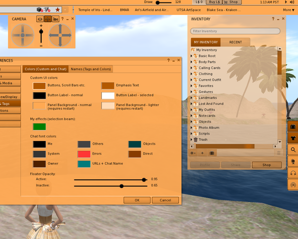
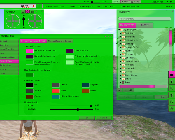
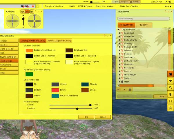
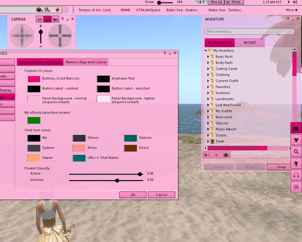
There are now two new themes in StarLight - Custom Dark and Custom Light (based on the "Original" and "Mono" themes) - with each accessing a slightly changed StarLight architecture to allow the changing of the colours of many UI elements. Under "Preferences->Colors & Tags" you will see six new colour selection boxes at the top when using those themes. These are:
- Buttons, scroll bars etc. - setting the colour of buttons, scroll bars, check boxes etc.
- Emphasis Text - This is typically the colour that is used for 'loading..' and other interactive text.
- Button Label - normal - The colour of the label text on buttons when unselected (except new FUI buttons).
- Button Label - selected - The colour of the label text on buttons when selected (except new FUI buttons).
- Panel background - normal - The normal colour of panels and floaters.
- Panel background - lighter - A slightly contrasting colour for elements of panels and floaters so that it is easier to spot lists, title bars etc. I suggest this is set to a slightly lighter version of the other panel colour for the best effect.
I suggest that the "Buttons, scroll bars etc." is not set to anything too dark and that the "Emphasis Text" is set to a darker version of the preceding colour that contrasts nicely with the interface. The great thing is you can play around with this easily because most changes happen as you do them rather than needing a restart.
Custom Light Example Settings
Custom Dark Example Settings
Making the UI even more colourable
Because of the way that Linden Lab has coded the viewer not all elements are as customisable as they could or should be (because of design, bugs or old code) - some colours in the UI are set by settings in the xml, textures, or both, and also some are hard-coded and inaccessible. For full customisation I am laying out in this section what other changes need to be made by viewer users who don't mind changing elements of the UI 's xml or textures (this just requires an ability to edit files in a text editor or very simple photo editing skills), and also by TPV (or personal viewer) developers who want to incorporate and improve on the StarLight CUI in their own builds.
The table below details these:
Under Construction


