Difference between revisions of "Viewer Visual Update"
| Line 27: | Line 27: | ||
=== Feedback and Ideas === | === Feedback and Ideas === | ||
Please leave your comments and suggestions on the [[Talk:Viewer_Visual_Update|discussion page]]. Once we release an official First Look preview you will be also be able to file issues in the [[Issue Tracker]]. | |||
Revision as of 21:54, 21 October 2007
Project Description
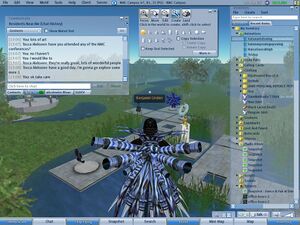
The purpose of this project is to modernize the visual appearance of the Viewer User Interface. We will use the Viewer's existing skinning hooks wherever possible, documenting and addressing technical blockers as required.
Project Goals
- Improve visual appearance with modern UI graphics and icons
- Improve discoverability through expanded use of iconography
- Improve approachability with a lighter, friendlier color scheme
- Improve legibility by using dark text on light backgrounds
- Document technical limitations of current skinning capabilities
Technical Blockers
Following is a list of technical limitations and bugs preventing implementation of the updated visual appearance. There is a longer list of skinning feature requests (such as human-readable texture filenames and the ability to apply gradients to windows) but such features will be incorporated at a later date as part of the Skinning project (see User Interface Roadmap). The modernized look and feel described above could be implemented immediately if the following issues were resolved:
- VWR-2445 Default IM/chat text color not settable in colors_base.xml
- VWR-2446 Viewer can't display UI textures that aren't in dimensions of powers-of-two
- VWR-2447 Text drop-shadow settings aren't configurable in XML, resulting in legibility issues under various color schemes
Sample Files
Coming soon...
Feedback and Ideas
Please leave your comments and suggestions on the discussion page. Once we release an official First Look preview you will be also be able to file issues in the Issue Tracker.
