Difference between revisions of "Viewer Skins/Dazzle Glass"
Elle Pollack (talk | contribs) (New page: A light-on-dark Dazzle skin with lots of transparency '''Instructions''' Right click and "Save As" this link: [http://www.themindstream.net/sandbox/dazzle_glass...) |
m (wiki-typo) |
||
| (2 intermediate revisions by the same user not shown) | |||
| Line 1: | Line 1: | ||
{{viewer skin | |||
|author=Elle Pollack | |||
|viewer_version=1.20 | |||
|skin_name=Dazzle Glass | |||
|inline_source=* | |||
|download_source=<br />[http://www.themindstream.net/sandbox/dazzle_glass_colors.xml external source] | |||
|skin_image=Dazzle glass.png | |||
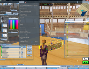
|summary=A light-on-dark Dazzle skin with lots of transparency | |||
|description=This color sceme still has the "Dazzle" look but returns to a lot of the white-on-dark-background mode of the classic for most floating windows. In the process I discovered the wonders of transparency settings - having a big window blocking my view has always been one of my deep seated peves, appearently. Active windows are semitransparent, inactive windows almost completely so. Some people might have a problem with that but it makes Dazzle much more useable for me. | |||
}} | |||
Latest revision as of 07:50, 18 April 2008
| By: | Elle Pollack |
|---|---|
| Viewer Version: | 1.20 |
| Information: | Dazzle Glass |
| Source: | view source on Wiki external source |
| Image: |
This color sceme still has the "Dazzle" look but returns to a lot of the white-on-dark-background mode of the classic for most floating windows. In the process I discovered the wonders of transparency settings - having a big window blocking my view has always been one of my deep seated peves, appearently. Active windows are semitransparent, inactive windows almost completely so. Some people might have a problem with that but it makes Dazzle much more useable for me.
<?xml version="1.0" encoding="utf-8" standalone="yes"?> <settings version = "101"> <TitleBarFocusColor value="88, 143, 219, 128" /> <FocusBackgroundColor value="60, 70, 82, 128" /> <DefaultBackgroundColor value="165, 180, 200, 30" /> <LabelTextColor value="255, 255, 255, 255" />
<ButtonSelectedBgColor value="62, 62, 62, 255" /> <ButtonSelectedColor value="255, 255, 255, 255" /> <ButtonUnselectedBgColor value="62, 62, 62, 255" /> <ButtonUnselectedFgColor value="255, 255, 255, 255" /> <ButtonBorderColor value="239, 156, 0, 255" /> <ButtonColor value="255, 255, 255, 255" /> <ButtonImageColor value="255, 255, 255, 255" />
<TextFgReadOnlyColor value="0, 0, 0, 200" /> <TextDefaultColor value="0, 20, 0, 255"/> <TextEmbeddedItemColor value="255, 255, 255, 255" /> <TextFgReadOnlyColor value="0, 0, 0, 200" /> <TextFgTentativeColor value="210, 210, 210, 128" />
<ScrollBgReadOnlyColor value="255, 255, 255, 140" /> <ScrollBgWriteableColor value="255, 255, 255, 140" /> <ScrollBGStripeColor value="145, 180, 220, 60" /> <ScrollDisabledColor value="128, 128, 128, 204" /> <ScrollSelectedBGColor value="50, 115, 185, 180" /> <ScrollSelectedFGColor value="0, 30, 60, 255" /> <ScrollUnselectedColor value="0, 30, 60, 255" /> <ScrollHighlightedColor value="145, 180, 220, 128" /> <ScrollbarThumbColor value="120, 160, 200, 255" /> <ScrollbarTrackColor value="183, 202, 220, 255" />
<MenuBarBgColor value="50, 64, 76, 230" /> <MenuDefaultBgColor value="77, 89, 99, 230" /> <MenuItemDisabledColor value="150, 150, 150, 150" /> <MenuItemEnabledColor value="225, 225, 225, 255" /> <MenuItemHighlightBgColor value="209, 221, 240, 180" /> <MenuItemHighlightFgColor value="0, 30, 60, 255" /> <MenuPopupBgColor value="77, 89, 99, 240" />
<PieMenuBgColor value="118, 156, 201, 0" /> <PieMenuLineColor value="255, 255, 255, 200" /> <PieMenuSelectedColor value="185, 200, 220, 120" />
<ChatHistoryBgColor value="94, 94, 94, 10" /> <ChatHistoryTextColor value="255, 255, 255, 255" /> <IMHistoryBgColor value="94, 94, 94, 10" /> <IMHistoryTextColor value="255, 255, 255, 255" />
<NetMapBackgroundColor value="0, 0, 0, 0" />
<AvatarNameColor value="251, 175, 93, 255" /> <FocusColor value="239, 156, 0, 255" /> <FloaterButtonImageColor value="255, 255, 255, 255" /> <ButtonCautionImageColor value="255, 255, 255, 255" /> <HealthTextColor value="255, 255, 255, 255" /> <MapAutopilotColor value="255, 128, 0, 255" /> <ContextSilhouetteColor value="239, 156, 0, 255" /> <ScriptBgReadOnlyColor value="180, 180, 180, 128" /> <ParcelTextColor value="230, 230, 230, 255" /> <ParcelHoverColor value="255, 255, 255, 255" /> <TimeTextColor value="210, 255, 210, 255" /> <BalanceTextColor value="143, 255, 190, 255" /> <HealthTextColor value="230, 115, 115, 255" /> <GroupOverTierColor value="110, 15, 15, 255" /> <FilterBackgroundColor value="75, 75, 150, 180" /> <FilterTextColor value="255, 200, 110, 255" /> <InventoryItemSuffixColor value="78, 64, 60, 255"/> <InventorySearchStatusColor value="0, 0, 0, 255" /> <ConsoleBackground value="0, 0, 0, 255" /> <FolderViewLoadingMessageTextColor value="240, 165, 90, 255"/>
</settings>
</xml>